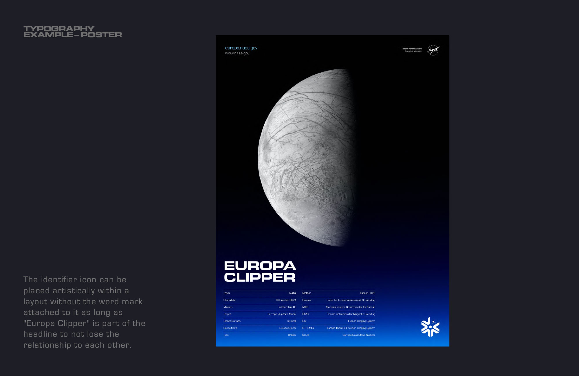
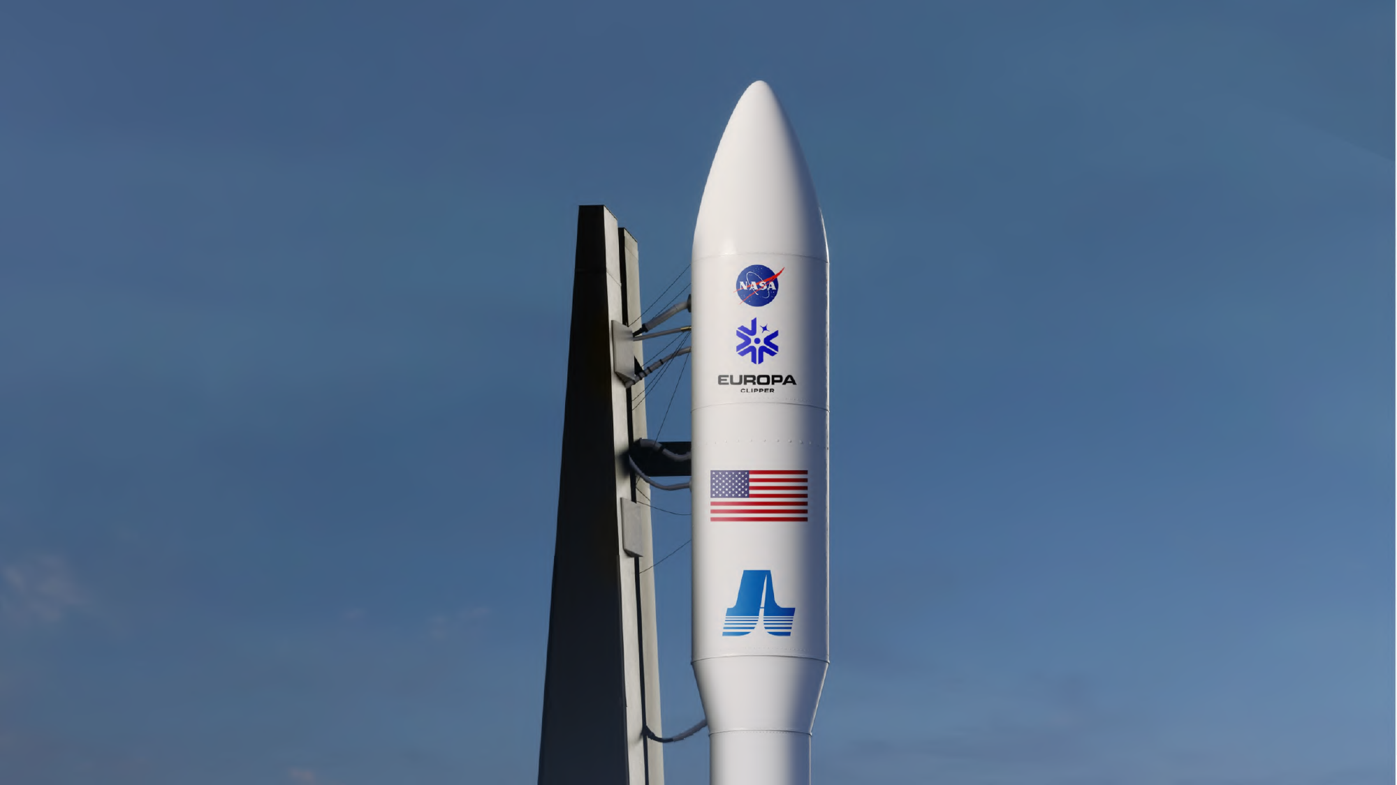
Branding NASA’s Mission to Jupiter’s Icy Moon
Europa Clipper takes NASA to Jupiter’s moon, Europa, to investigate its potential to harbor life. As a team, we developed the mission’s visual identity, crafting a design that reflects the mission’s scientific objectives while honoring NASA’s legacy of exploration.
The mission identifier draws inspiration from the spacecraft’s graceful trajectory as it approaches Europa. The sweeping, angular curves represent the orbital path the spacecraft will take, swooping around Jupiter and flying close to Europa’s surface. These curves also subtly reference the iconic “A” from the NASA logotype. Together, they form an ice crystal—a nod to Europa’s frozen surface and its hidden ocean. Within the design, the star represents the spacecraft, while the central circle symbolizes Europa itself, visually tying together the mission’s core elements.